From Zero to Dashboard – Getting Your Metrics Game Up to Speed
At the University of Tennessee, Knoxville, our HR team was constantly peppered with ad hoc requests from campus units. While we wanted to provide timely and quality responses to these inquiries, we were challenged by multiple data systems that held disparate pieces of information, and the manual data manipulation required to respond to these requests.
We began to ask ourselves questions:
- What tools were we using to gain insights into the employee population?
- What did campus clients want to know about campus populations that they did not know currently?
- How accessible was human resources data?
- How long would it take to gather and compile information about such things as employee diversity on campus or employee turnover?
After determining that we needed a dashboard, we thought about how we could build the dashboard within our budget. After a comprehensive review of resources, we found that we could develop a dashboard without spending tens of thousands of dollars on a consultant.
You Need a Dashboard, Now What?
There are many benefits to developing an HR dashboard. A dashboard provides a source of information for leaders across campus in an on-demand, visual environment. It also provides data about the colleges, divisions and departments across campus to help HR deliver on its strategic partner promise. HR committed to assisting our campus partners to get relevant, accurate and timely data from our systems in an accessible format.
Often, departments need information about their employees that is hard to obtain at the unit or college level and can only be obtained through a central HR office. And those in the central HR office may even find that the sources of data needed to answer the unit or college request are clunky, don’t communicate well, or are questionable in terms of accuracy! The beauty of a dashboard is that it pulls from many different sources of data, requires a data assurance phase (to make certain the data is accurate), and displays those sources of data all in a single visual representation.
A dashboard provides a source of information for leaders across campus in an on-demand, visual environment. It also provides data about the colleges, divisions and departments across campus to help HR deliver on its strategic partner promise.
Once we determined that a dashboard was the way to go, we needed to gain executive sponsorship and a project champion. Our project champion, the chief human resources officer, helped us establish the priority of developing the dashboard at the executive level. Our executive sponsor, the head of finance and administration, was on the campus cabinet and could get buy-in at that level.
Realizing that our HR team did not possess the technical skillset to develop an interactive dashboard, we partnered with our office of information technology to begin scoping out the project. The staff in OIT had the necessary skills and the software, SAS Analytics Software, to create the dashboard. They were also working on dashboards for other campus areas. The partnership between HR and OIT was vital to the success of the project.
OIT provided a scoping document template which gave the HR team a framework to describe the strategic impact and business need of the project, the definition of success, the structure of the data, the metrics with definitions, and the amount of data to display. We used various sources, including CUPA-HR’s Knowledge Center articles, to research metrics and calculations to include in the dashboard. Examples of the metrics we initially included were turnover, retention, time to fill, leave usage, vacancy rate and trend data.
After the scoping document was complete and signed off by HR leaders, we began work to identify data sources and owners, and clean up the data as necessary. (Pro tip: If some of the data you need in your dashboard sits outside of your area of accountability, start conversations with that data owner early in the process. You need to get into their priority of work, not vice versa!)
Our data was stored in a human resources information system (HRIS) and separate applicant tracking system (ATS), which added to the complexity of the project. Our IT partners were instrumental in communicating with the data owners and requesting the files needed, formats, delivery mechanism and frequency. They were also able to help identify when the data wasn’t what they expected to see.
What Happened Throughout Development?
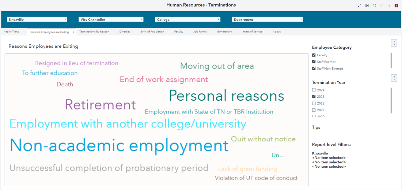
OIT developed a database to store data extracted from the human resources information system. We established a weekly meeting cadence with our IT partners. The meetings provided a space to discuss data issues, metrics calculations and graphic display options. SAS software functionality evolved over the course of the project, so our IT partners provided new options to display data. In one instance, word cloud technology became available, and we found this to be a meaningful way to display reasons employees were exiting the university. There were also times when the graphic display did not meet our needs, and we asked IT to make adjustments. For example, we found that a bar graph did not adequately tell the story of our termination data, so our IT partners identified the word cloud option seen below. Throughout the project we tested the data and calculations for accuracy and made adjustments as necessary.
In addition to the current data extractions from the HRIS, historical data files were also exported. We were able to develop trend reports for metrics like turnover, headcounts and diversity. The additional historical data also allows leadership to view turnover for past years and analyze the reasons employees leave, along with the length of time an employee stays before leaving. The trend dashboards provide data for viewing the influence of programs implemented to impact turnover and retention over time. We currently have seven years of data available and drop the oldest year off when a new year begins.
Final Steps Before Rollout
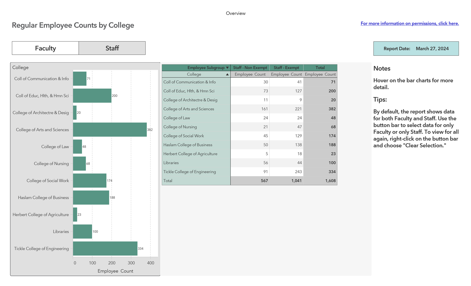
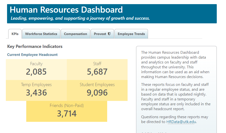
Once we had reports ready to roll out to our campus, we needed to determine who would have access to the specialized reports. We had determined early on that we only wanted certain parts of the dashboard available to an external audience and other parts would be available to internal partners through a secure login. Security of the data on the dashboard was a high priority. As we worked through this security process, we realized that the provost needed to have overview reports of the data for all the colleges, which we did not identify during the scoping phase of the project. This realization prompted the development of the provost module. The image below provides the headcount of regular faculty and staff by college. This gives the provost’s office a snapshot of staffing levels.
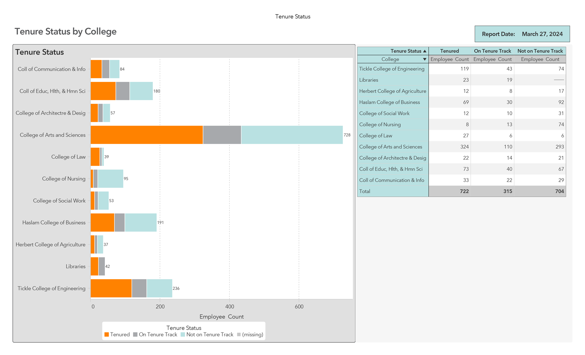
The overview reports in the provost module show headcounts for each college on diversity, generations, length of service, academic rank and tenure. We also developed detailed reports that focused on faculty metrics and could be viewed as a total of all colleges or in detail by each college. The graphic below is a sample of the tenure status by college report, which displays a comparison of number of tenured faculty by college. This information was not easily accessible before the dashboard was implemented.
Our last step before rollout was to pilot the dashboard to a small subset of users. We chose these users from academic and administrative areas who had previously requested HR data. After an introductory presentation of the dashboard, we gathered feedback through a survey. We used this feedback to modify user permissions and graphic displays, as well as to design other visuals to meet their data needs.
In preparation for campuswide rollout, we provided training sessions via Zoom and uploaded recorded presentations to our HR website. Finally, we shared the dashboard with HR partners across campus and leadership for on-demand use. As new reports and graphics were added, we notified users via email of their availability. This enabled us to remain in regular contact with campus leadership about the dashboard and its usefulness.
Here you’ll see some examples from UT Knoxville’s HR dashboard. Below is the external-facing landing page that provides overall metrics for our campus. Information about diversity, a snapshot of employee generational groups and years of service are also included on the landing page.
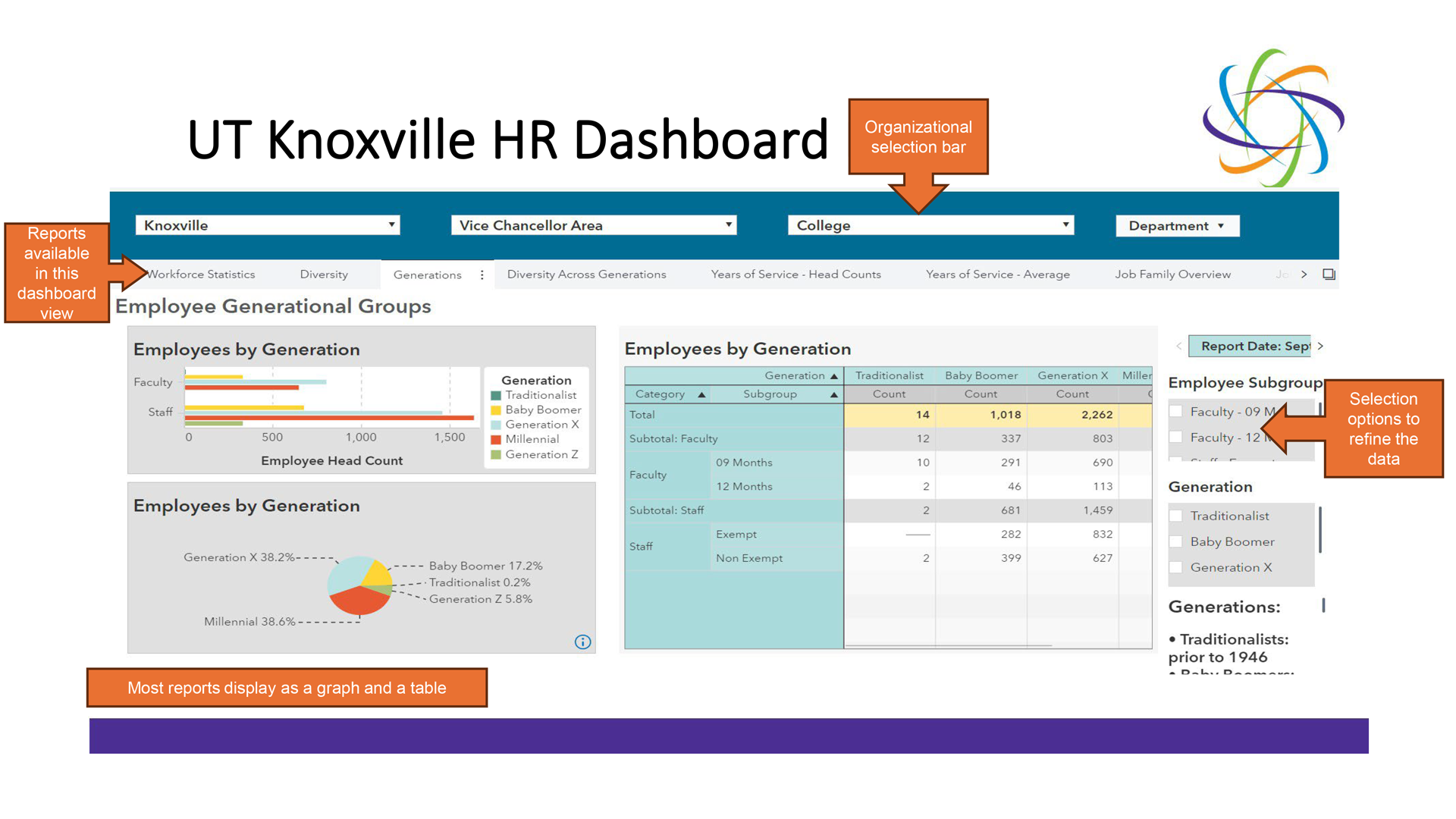
Once an internal user logs into the Dashboard, there are a variety of selection options to refine the data view (below). We also included the date on each report that indicates the last time the data was updated. The majority of the dashboard data is updated each night.
Lessons Learned
We learned some valuable project management lessons working on the dashboard.
- Not all data can be exported in a usable format. We planned to include a recruitment section in our dashboard, but as work on the dashboard progressed, we determined it was not possible to pull data from our ATS in a usable format within the timeframe we’d established. We set this aside as a future enhancement.
- Request the data files at the beginning of the project for all the dashboard elements you think you will need. The scoping document identified the data files needed, so we requested the files early and prioritized the data needed with the data owners. The data files were not received at the same time, but as the data files were received, different dashboard components were developed.
- Timing is everything! Plan for longer than you think you will need to create a dashboard. Our project took about two years to complete and began before the COVID-19 pandemic. It was substantially delayed as IT priorities shifted to campus initiatives during the pandemic.
- Focus on the early wins! We initially planned to share the entire dashboard once all the reports were completed. However, with the data feed delays, and the issues facing our campus partners due to the pandemic, we chose to introduce the dashboard in phases. Piloting the dashboard to the small group of HR partners allowed us to gather feedback and celebrate early wins.
“These reports saved me so much time from having to go through all of the data myself!!”
One of our campus partners said the following during the pilot phase of the rollout:
- “We were able to pull data related to our employee retention thanks to the good work and development of the HR dashboard. It’s not the only ROI we’ll use, but THIS one (employee retention) is extremely invaluable to share!”
- “I really appreciate being able to look at the termination reasons for my area to understand our turnover rate better. It is quick and easy to understand.”
- “These reports saved me so much time from having to go through all of the data myself!!”
Beyond the Dashboard Development and Go-Live
Once the dashboard was available to our leadership across campus, we began receiving additional requests for access. Due to the number of requests to use the dashboard, we determined that holding a training session would benefit our campus partners. We expected 20 to 30 participants in attendance. The reality was 70 people registered for the training, including upper-level academic leadership. This level of participation and interest was the greatest acknowledgement that the dashboard was relevant and beneficial.
Looking back on the HR dashboard project, some might ask, was it worth it? Absolutely! Our leadership can use human resources data and tools to more easily make informed HR decisions. They research trends in their turnover and can see why people are leaving. They can view their retirement eligibility statistics and make strategic decisions based on three- and five-year projections.
We found the dashboard helpful when our campus was considering a voluntary retirement incentive program (VRIP). We easily provided data to our campus leadership of retirement eligibility projections and scenarios for consideration. It ultimately helped our campus implement a VRIP for faculty. This information was not available to leadership prior to the HR Dashboard.
Anytime a leadership team can make informed decisions using HR data, it is worth it!
Looking back on the HR dashboard project, some might ask, was it worth it? Absolutely! Our leadership can use human resources data and tools to more easily make informed HR decisions.
What Is the Future of the Dashboard?
As the University of Tennessee moves to a new ERP, we plan to continue providing trend data through the dashboard to our campus partners. During the scoping phase of the project, we planned to build a recruitment module, however, due to data constraints, we were not able to complete this module. We envisioned a recruitment module that provides leadership information about vacancy rates, time to fill and candidate sourcing. We hope the new ERP will provide usable data files that we could not access earlier to build this out. Once a recruitment module is completed, the dashboard will provide campus partners with HR data and metrics from hire to retirement. As new data becomes available, we will assess its relevance to existing dashboard reports and determine if building new reports (or changing existing reports) would provide valuable information to our campus partners.
About the authors: Mary Lucal is vice president and chief human resources officer at George Mason University, and is formerly CHRO of the University of Tennessee, Knoxville; Tarah Keeler is interim associate vice chancellor and chief human resources officer; and Elizabeth Smith is project manager of human resources, both of the University of Tennessee, Knoxville.